Week 3 - Day 3 - Class Day 8
8.1: Styling forms
Styling forms with CSS
Web forms are an important part of many websites. A usable form allows the user to quickly and painlessly enter data. Forms require CSS formatting to improve usability.
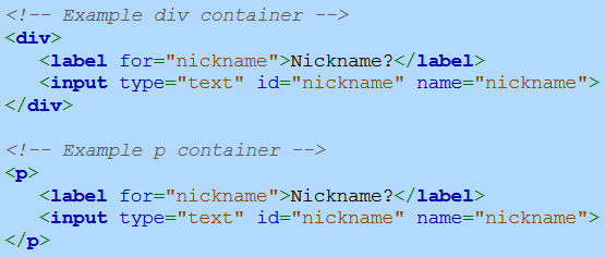
Paragraphs vs. divs
The W3C recommends putting form elements in <p> elements, but many leading web frameworks like Bootstrap use <div> elements instead. Either container is acceptable, and this material uses both styles.
Proper use of field labels
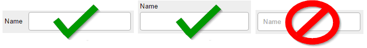
Form field labels should be placed uniformly in the same location on a website's web forms. The best places for labels are immediately above or to the left of an input field. Some developers use only the placeholder HTML attribute in place of labels to save screen space and reduce clutter, especially on mobile devices. However, usability experts warn that placeholders used as labels can create a number of problems for users and should be avoided.
Improving text input fields
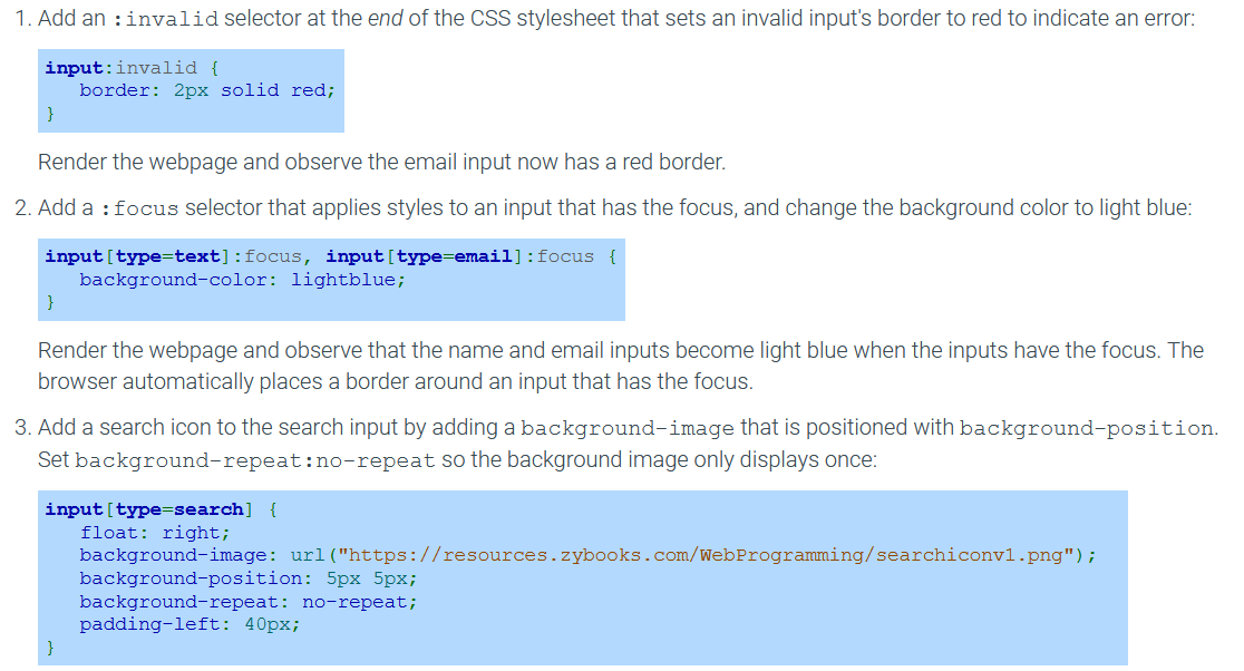
An input field can be further improved. Changing an input's border color or background color focuses the user's attention to the input. Ex: Changing the input border color to red may indicate an error with the input. Adding a commonly recognized icon to an input field can improve the user's ability to recognize the purpose of the input. Ex: Adding a search icon to a search input.
Styling radio buttons and checkboxes
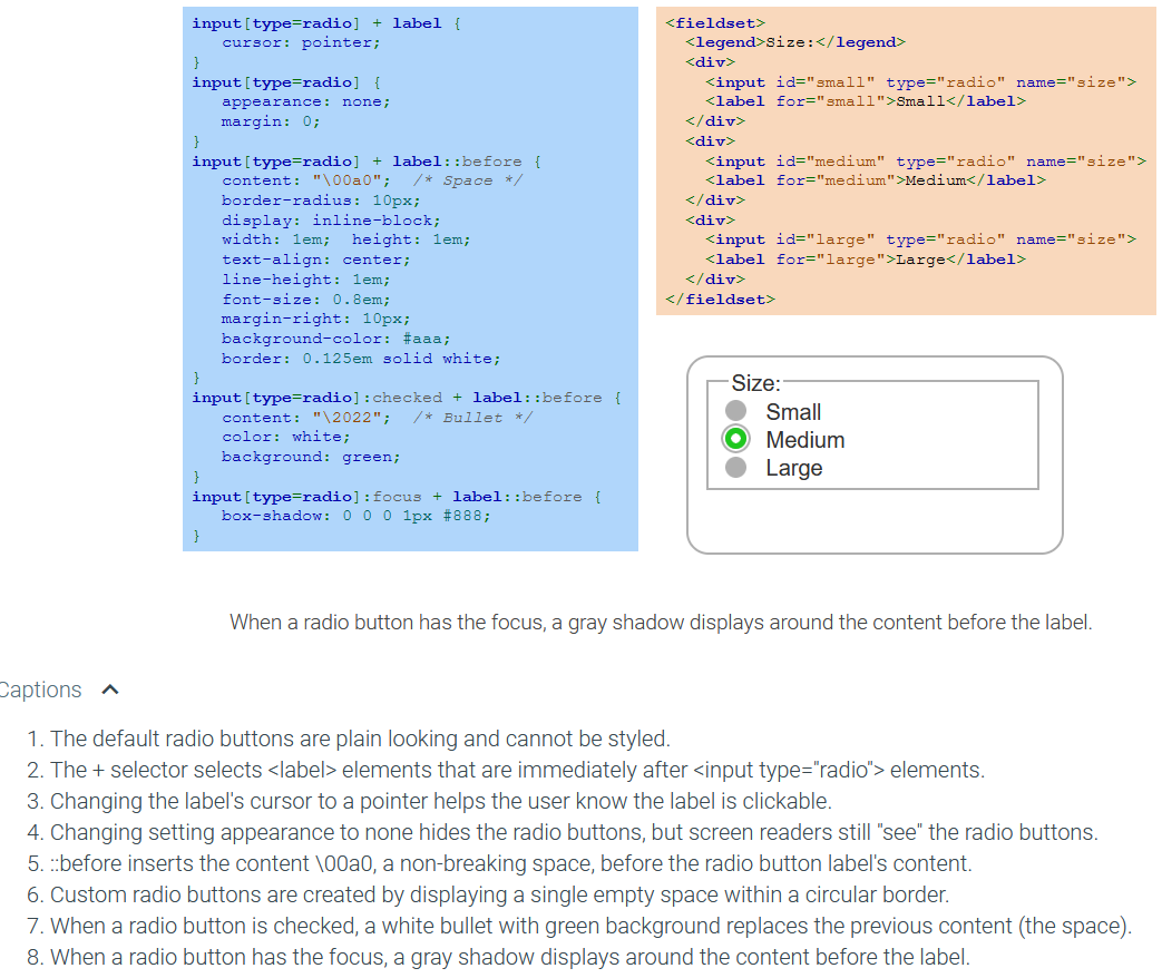
Radio buttons and checkboxes use the styling properties supplied by the browser and may differ between browsers. Styling radio buttons and checkboxes requires hiding the default widget, then displaying a custom widget before each label that changes appearance when checked or focused.
The CSS property appearance is used to control a widget's appearance based on the operating system's theme. Setting appearance to none hides the widget.
To display a custom radio button or checkbox, the ::before pseudo-element selector and content property are used to insert content before the label's content that looks like a radio button or checkbox.
Exploring further:
CSS Forms from W3Schools
An Extensive Guide To Web Form Usability from Smash Magazine
Placeholders in Form Fields Are Harmful from Nielsen Norman Group
Replacing Radio Buttons Without Replacing Radio Buttons from SitePoint
8.2: Special effects
Text shadows
Shadows are added to text using the CSS property text-shadow which accepts four values:
offset-x - Horizontal pixel offset of shadow
offset-y - Vertical pixel offset of shadow
blur-radius - Optional shadow blur (default is 0)
color - Optional shadow color (default is usually the current CSS color)
The syntax is the same as the order of the list 'text-shadow: offset-x offset-y blur-radius color'
You can apply multiple shadows to one text using the syntax'text-shadow: v1 v2 v3 c1, v4 v5 v6 c2' Note the seperation using commas for the different text shadows.
Box shadows
The CSS property box-shadow adds a shadow to the box around an element using the following properties:
inset - Optional value that draws the shadow inside the box (default is outside the box)
offset-x - Horizontal pixel offset of shadow
offset-y - Vertical pixel offset of shadow
blur-radius - Optional shadow blur (default is 0)
spread-radius - Positive value causes shadow to grow, negative values to shrink (default is 0)
color - Optional shadow color (default is usually the current CSS color)
Like with text shadows, the syntax is 'box-shadow: inset* offset-x offset-y blur-radius spread-radius color' with inset being completely optional, when writing a numerical value into this property it will read it in the order from offset-x to spread-radius.
This also allows multiple shadows to be made using the same syntax'box-shadow: values1, values2' once again seperated by a comma
Rounded corners
An element border's corners can be rounded using the CSS property border-radius, which is assigned one to four radius values.
Single value - All four corners are equally rounded
Two values - First value is top-left and bottom-right corners, second value is top-right and bottom-left corners
Three values - First value is top-left, second is top-right and bottom-left, third is bottom-right
Four values - First value is top-left, second is top-right, third is bottom-right, fourth is bottom-left
Each corner may also be assigned a radius using four CSS properties:
border-top-left-radius
border-top-right-radius
border-bottom-left-radius
border-bottom-right-radius
Border images
The CSS property border-image renders an element's border using sections of an image. The border image takes the place of any border properties specified by border-style. The following CSS properties are specified by border-image all at once:
border-image-source - Image URL
border-image-slice - Image section size
border-image-repeat - "repeat" to repeat the image section, "round" to repeat the image section but resize the image if needed to fit, or "stretch" to stretch an image section
A border image will not appear unless the border-width property is non-zero and border-style is set to any legal value except none and hidden.
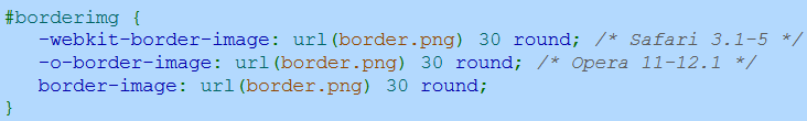
The syntax is 'border-image: url("yourUrl") sliceSize repeat;'
Essentially what the slice does is represent how wide each sample should be

That image above is 90px tall and wide, setting the slice to 30 means that each block is 30px X 30px
CSS3 browser support
Most modern browsers support CSS3, but some CSS3 properties require vendor prefixes to work on certain browsers. A vendor prefix is a prefix added to an experimental or nonstandard CSS property that only works on a specific browser type. Typical vendor prefixes are:
-webkit- for Chrome, Safari, and newer versions of Opera
-moz- for Firefox
-ms- for Internet Explorer
-o- for older versions of Opera
The following CSS specifies a border-image property for WebKit and Opera browsers:
Linear gradients
A CSS background may use gradient colors that transition from one color to another. Two CSS gradients exist:
Linear gradient - A gradient that follows a straight line
Radial gradient - A gradient that radiates outward into an ellipse
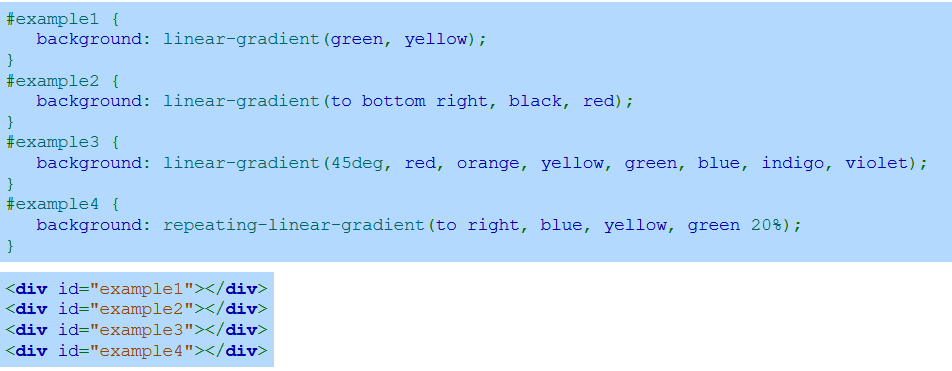
The CSS function linear-gradient(color1, color2) creates a linear gradient that transitions from color1 to color2 when moving from the top edge to the bottom edge. Additional colors can be supplied to the function. Ex: linear-gradient(red, green, blue, yellow) transitions from red to green to blue to yellow when moving from top to bottom.
To change the gradient's direction, the first argument to linear-gradient can be a direction or an angle:
Direction - A direction of left, right, top, or bottom with the word to in front. Ex: to left creates a linear gradient that moves from right to left, and to bottom right goes from the top-left corner to the bottom-right corner.
Angle - A CSS angle that points in the direction of the linear gradient. The angles 0deg, 90deg, 180deg, and 270deg correspond to to top, to right, to bottom, and to left, respectively.
The repeating-linear-gradient() function repeats a linear gradient where the color values are supplied an optional percent. The percentage value after the last color is the percent of the gradient's total length the repeating gradient should occupy. Ex: repeating-linear-gradient(red, yellow 10%) means the red to yellow gradient occupies 10% of the gradient's total length and is repeated to fill the entire background.
Radial gradients
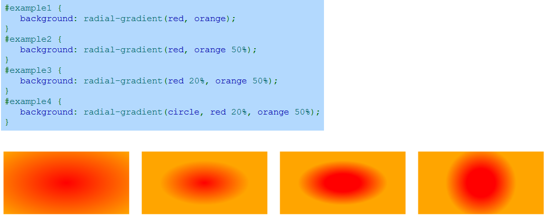
A radial gradient is created with the CSS function radial-gradient(color1, color2), which creates an ellipse-shaped gradient that begins with color1 in the center and ends with color2 on the perimeter. More than two colors may be specified. A percentage or length can be placed after a color to give more emphasis to the color. Ex: radial-gradient(red 10%, yellow 30%) gives more emphasis to red and yellow than the default rendering.
The ellipse shape of a radial gradient fits the gradient's bounding rectangle. However, a circular radial gradient can be created with the circle argument. Ex: radial-gradient(circle, red, yellow) creates a circle gradient.
Positioning radial gradients
A radial gradient's ellipse or circle is centered by default in the enclosing rectangle, but the center position can be specified using "at centerX centerY" where centerX and centerY specify a distance or percentage. Ex: radial-gradient(at 50px 10px, yellow, green) specifies a center that is 50px from the left edge and 10px from the top.
By default, a radial gradient's shape reaches to the farthest corner of the containing rectangle. An extent keyword describes the size of the radial gradient's shape:
closest-side - Circle touches the rectangle's side closest to the circle's center. Ellipse touches the vertical and horizontal sides closest to the ellipse's center.
farthest-side - Circle touches the rectangle's side farthest from the circle's center. Ellipse touches the vertical and horizontal sides farthest from the ellipse's center.
closest-corner - Circle or ellipse touches the corner closest to the shape's center.
farthest-corner - Circle or ellipse touches the corner farthest from the shape's center. (Default behavior.)
Exploring further:
CSS3 text-shadow Property from W3Schools
CSS3 box-shadow Property from W3Schools
CSS3 Rounded corners from W3Schools
CSS3 border-image Property from W3Schools
CSS3 Gradients from W3Schools
8.3: Animation
Animations and Keyframes
While you can use Javascript and Javascript libraries to do animations, you can also do it with CSS. This is good because it provides less load on the computer as well as working on devices with Javascript blocked.
A CSS animation's behavior is defined with the @keyframes rule, which contains a keyframe list. A keyframe list has a name and contains the keyframes or the properties and values that will be animated. A keyframe list contains two keyframe selectors:
from - The animation starting state that lists the CSS properties and values that apply when the animation begins
to - The animation ending state that lists the CSS properties and values that the "from" values become by the time the animation ends
Percentages may be used to specify keyframes at various points during the animation. Ex: 0% is equivalent to from and 100% is equivalent to to. The value 50% indicates the animation state at the halfway point.
These both follow the same syntax of 'from/to/%{CSS IN HERE}' it should be contained within a @keyframes rule of syntax '@keyframes name{to/from syntax}' with the name being the same name defined with 'animation-name: name;'
To create an animation, two CSS properties must be defined:
animation-name - Names the keyframe list associated with the animation
animation-duration - Length of the animation in seconds (s) or milliseconds (ms)
An animation begins immediately when the browser renders the webpage unless an animation-delay is used to delay the start of the animation.
In the smiley face animation above, each transition from one keyframe to the next began with a slow start, then fast, then a slow end. The animation-timing-function property controls an animation's speed between keyframes. Several timing functions are available:
ease - Slow start, then fast, then slow end (default)
linear - Same speed throughout
ease-in - Slow start
ease-out - Slow end
ease-in-out - Slow start and end
cubic-bezier(n1,n2,n3,n4) - Specify numbers that control speed based on a Bezier curve
Other animation properties include:
animation-iteration-count - Indicates the number of times the animation will run. The value infinite runs the animation repeatedly without stopping. Ex: animation-iteration-count: 3 runs the animation three times.
animation-direction - Indicates animation direction
normal - Normal direction (default)
reverse - Reverse direction
alternate - Alternate between normal and reverse
alternate-reverse - Alternate between reverse and normal
animation - Shorthand property indicating the animation name, duration, timing function, delay, iteration count, and direction. Ex: animation: move 3s linear 2s infinite normal.
Transitions
A CSS transition animates an element's transition from one state to another when an element's CSS property changes value. Ex: A transition may animate an element getting wider when the element's width is increased. Transitions are commonly used with the :hover pseudo-class to trigger an animation when the user mouses over an element.
Transitions differ from CSS animations in two ways:
Transitions execute when an element's property values are changed, unlike CSS animations that execute at a particular time.
Transitions provide less control over the animation than CSS animations.
The transition property defines a transition by specifying one or more CSS properties and each property's transition duration.
The transition-timing-function property controls the speed of the transition. Several timing functions are available, and all complete in the same amount of time:
ease - Slow start, then fast, then slow end (default)
linear - Same speed throughout
ease-in - Slow start
ease-out - Slow end
ease-in-out - Slow start and end
cubic-bezier(n1,n2,n3,n4) - Specify numbers that control speed based on a Bezier curve
The transition-delay property delays the transition's start.
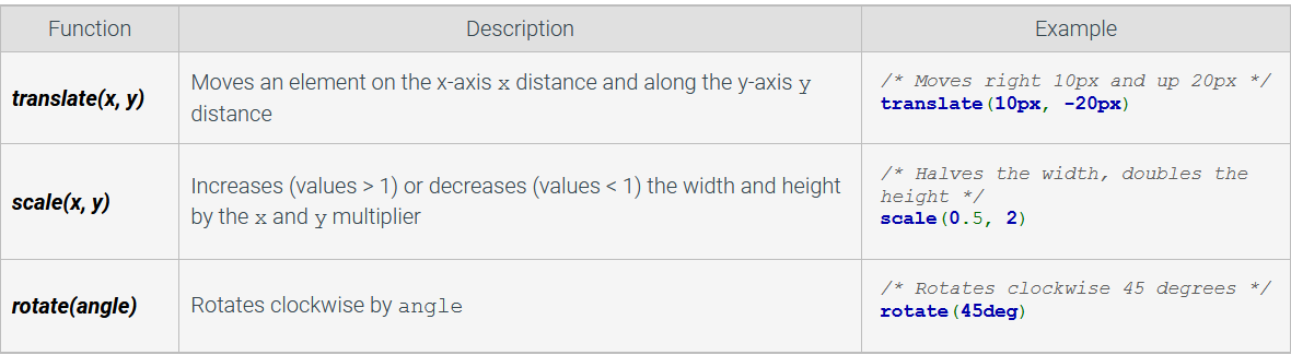
Transformations
The transform property applies a 2D or 3D transformation to an element. A transformation is a graphical operation that alters the position, shape, or orientation of an object. The transform property is assigned a transformation function. A selected number of 2D transformation functions are summarized in the table below.
Transformations are used in animations and transitions to create engaging webpages.
These are used in css with the syntax 'transform: function;'
Exploring further:
CSS3 Animations from W3Schools
CSS3 Transitions from W3Schools
CSS3 2D Transformations from W3Schools
CSS3 3D Transformations from W3Schools