Week 3 - Day 2 - Class Day 7
7.1: Grid Layout
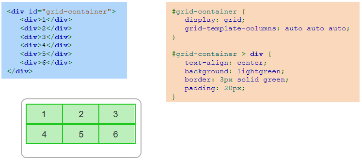
Grid container and grid items
Grid layout is a CSS layout mode that divides a webpage into a rectangular grid in which to position page elements. Grid layout is ideal for designing two-dimensional webpage layouts.
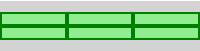
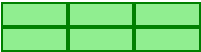
A grid container is an element that has the CSS property display set to grid to create a block-level grid container or inline-grid to create an inline grid container. Ex: <div style="display: grid">. A grid item is a child element of a grid container that is by default placed into a single grid cell.
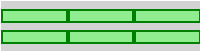
The grid-template-columns property defines the grid container's number of columns and optionally the width of each column. Ex: grid-template-columns: 50px 90px auto auto; specifies 4 values that create 4 columns: the first is 50px wide, the second is 90px wide, and the third and fourth columns are automatically sized to fit the remainder of the grid width.
Controlling the grid container
The default behavior of a grid container can be modified with various CSS properties:
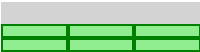
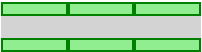
The gap property defines the gap between each grid row and column. Ex: gap: 5px 25px; puts a 5px gap between each row and a 25px gap between each column.
The grid-template-rows property defines the height of each row. Ex: grid-template-rows: 20px 40px; makes the first row 20px tall and the second row 40px tall.
The justify-content property horizontally aligns the grid items inside the grid container using values:
start - Aligns grid flush with the grid container's starting edge.

end - Aligns grid flush with the grid container's ending edge.

center - Aligns grid in the center of the grid container.

stretch - Stretches the grid items to fill the grid container width.

space-around - Places equal spacing between grid items with half the space on either side of the grid container.

space-between - Places equal spacing between grid items with no space on either side of the grid container.

space-evenly - Places equal spacing between grid items, including the sides of the grid container.

The align-content property vertically aligns the grid items inside the grid container using values:
start - Aligns grid flush with the grid container's starting edge.
end - Aligns grid flush with the grid container's ending edge.
center - Aligns grid in the center of the grid container.
stretch - Stretches the grid items to fill the grid container height.
space-around - Places equal spacing between grid items with half the space on either side of the grid container.
space-between - Places equal spacing between grid items with no space on either side of the grid container.
space-evenly - Places equal spacing between grid items, including the sides of the grid container.
The justify-content and align-content properties have no effect unless the grid width or height is less than the grid container's width or height.
Controlling grid item placement
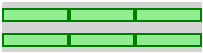
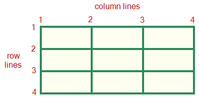
A grid item by default appears in a single row and column based on the ordering of the grid item within the grid container. However, grid items may be positioned at specific grid locations using the column line and row line numbers as illustrated in the figure below.
A grid item may be placed in a specific row or column or span multiple rows and/or columns using various following CSS properties:
The grid-row property lists the grid item's starting and ending row line numbers. Ex: grid-row: 1 / 3; makes the grid item start at row line 1 and end at row line 3, so the grid item spans 2 rows.
The grid-column property lists the grid item's starting and ending column line numbers. Ex: grid-column: 1 / 4; makes the grid item start at column line 1 and end at column line 4, so the grid item spans 3 columns.
The grid-area property lists the grid item's starting and ending row and column numbers. Ex: grid-area: 1 / 2 / 3 / 4; makes the grid item start at row line 1 and column line 2 and end at row line 3 and column line 4, so the grid item spans 2 rows and 2 columns.
If this diagram and description is confusing, think of it like this: the start value x/? represents the starting line and ?/y represents the ending line. If you want your item to span 3 columns in the diagram above, you would write 1/4 because it spans from column line 1 to column line 4, taking up 3 cells on the way.
Naming grid items
Grid items may be assigned names with the grid-area property. The grid container's grid-template-areas property specifies the grid layout using the named grid items.
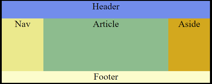
Naming grid items Example
The goal of this example is to create this layout
<!DOCTYPE html>
<html>
    <head>
        <style>
            //'grid-area: x' sets the name for these grid elements which can then be used later with 'grid-template-areas:' see example below.

            body {
                background: black;
                font-size: 2em;
                text-align: center;

                display: grid;
                grid-template-columns: 150px auto 150px;
                grid-template-rows: 60px 180px 40px;

                grid-template-areas:
                "head head head"
                "nav article aside"
                "foot foot foot";
            }

            header {
                background: cornflowerblue;

                grid-area: head;
            }

            nav {
                background: khaki;

                grid-area: nav;
            }

            article {
                background: darkseagreen;

                grid-area: article
            }

            aside {
                background: goldenrod;

                grid-area: aside;
            }

            footer {
                background: lemonchiffon;

                grid-area: foot;
            }

        </style>
    </head>

    <!--Note this example could be done in a div, it is done within the html body for this example-->
    <body>
        <header>Header</header>
        <nav>Nav</nav>
        <article>Article</article>
        <aside>Aside</aside>
        <footer>Footer</footer>
    </body>
</html>
Exploring further:
CSS Grid Layout Module from W3Schools
CSS Grid Layout Browser Support from caniuse.com