Week 3 - Day 1 - Class Day 6
6.1: Positioning elements
The position property
The CSS position property gives developers more control over where elements should appear in the browser. It uses the syntax
position: mode/type;static - Static positioning is the default positioning.
relative - Relative positioning positions the element relative to the element's default position.
fixed - Fixed positioning positions the element relative to the viewport in a fixed location.
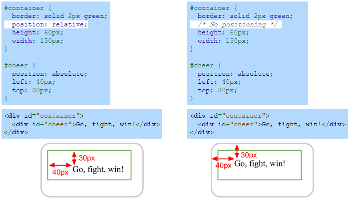
absolute - Absolute positioning positions the element relative to the nearest positioned ancestor.
Fixed positioning
Fixed positioning places the element at a fixed location in the viewport, and scrolling does not move the element. A viewport is the visible area of a webpage. The fixed element is detached from the normal flow of elements in the page and is layered on top of the page contents. Essentially if a display has 'position: fixed;' it will always stay in the same position no matter how you scroll the website, this is typically used for navigation bars and other similar elements.
Absolute positioning
Absolute positioning is similar to fixed positioning except:
The position is based on the nearest positioned ancestor element that uses fixed, absolute, or relative positioning. If no positioned ancestor element exists, the element is positioned relative to the document body.
An absolute-positioned element scrolls with the document unless an ancestor element is using fixed positioning.
The z-index property
The z-index property (syntax is 'z-index: number;' in your CSS file) represents the height of the element. This can be used as things such as fixed, relative or absolute positioning may result in elements overlapping, this resolves any issues with the order they are displayed on top of eachother. The higher the z-index, the higher off the page it is and will display over the top of elements with a lower z-index.
On the left side of the figure below, the browser renders the square elements in the order the elements appear in the HTML: The orange square is rendered first, and the green square is rendered last. The right side of the figure shows how the ordering changes using the z-index property: The orange square has the largest z-index and therefore appears on top.

Exploring further:
CSS Layout - The position Property from W3Schools
6.2: Box model
Box model components
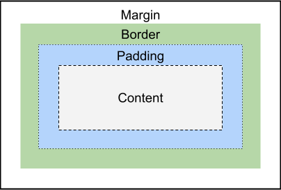
HTML elements take up space on the webpage. The box model describes the size of each element as a series of nested boxes. The box model is important to understand when considering design and layout.
Content: The innermost box contains the content of the element, such as text and images.
Padding: The padding box contains the content box and adds a transparent area around the content.
Border: The border box contains the padded content and adds an optionally colored area around the padding.
Margin: The margin box contains all three boxes and adds a transparent area around the border.
The CSS properties that control the padding, border, and margin are:
The padding property specifies the padding thickness. Ex: padding: 5px; creates a 5 pixel padding around the content.
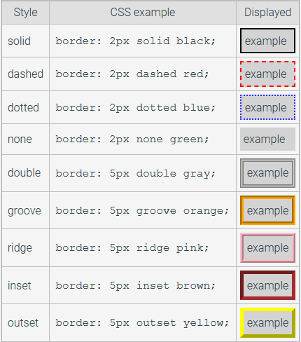
The border property specifies the border's thickness, style, and color. Ex: border: 2px solid blue; creates a solid blue border that is 2 pixels thick.
The margin property specifies the margin thickness. Ex: margin: 10px; creates a 10 pixel margin.
The content, padding, margin, and border boxes are rendered according to the following rules:
The content is displayed with a background according to the element's background color.
The padding is transparent and will be displayed using the same color as the element's background.
The border can be either colored or transparent. If transparent, the border will be displayed with the same color as the padding.
The margin is transparent and will be displayed using the background color of the parent element.
Box sizing
The padding and margin properties may have from 1 to 4 values:
One value - Specifies uniform thickness around the box. Ex: margin: 20px; specifies 20px margin thickness around the box.
Two values - Specifies top and bottom, right and left thickness. Ex: margin: 10px 20px; specifies 10px top and bottom margins and 20px right and left margins.
Three values - Specifies top, right and left, and bottom thickness. Ex: margin: 10px 30px 20px; specifies 10px top margin, 30px right and left margins, and 20px bottom margin.
Four values - Specifies top, right, bottom, and left thickness. Ex: margin: 10px 30px 20px 40px; specifies 10px top margin, 30px right margin, 20px bottom margin, and 40px left margin.
The padding, border, and margin CSS properties can apply only to one side by adding a -top, -left, -bottom, or -right suffix to the CSS property. Ex:
margin-top:number
margin-bottom:number
margin-left:number
margin-right:number
Content width and height
A block element's content spans the width of the enclosing parent element by default, but the content size can be changed with the width and height CSS properties:
The width property specifies the content's width. Ex: width: 20px; makes the content 20px wide.
The height property specifies the content's height. Ex: height: 30px; makes the content 30px high.
NOTE: height and width do not work with inline elements as they take up the minimum space possible, to use height and width display:inline-block must be used.
Border styles
The border property combines the border width, style, and color. Each CSS property may also be specified separately:
The border-width property specifies the border's width. Ex: border-width: 5px; specifies a border that is 5px thick.
The border-style property specifies the border's style. Ex: border-style: dashed; specifies a border that is dashed.
The border-color property specifies the border's color. Ex: border-color: green; specifies a border that is green.
But in general it is easier to add borders using the common syntax of 'border: width type color'
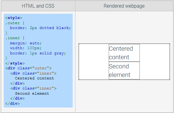
Margin collapsing and horizontal centering
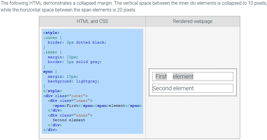
Vertical margins of two elements can sometimes combine or collapse into a single vertical space. Horizontal margins never collapse. Ex: Adjoining margins of two vertically stacked block elements collapse. The resulting margin size equals the top element's bottom margin or the bottom element's top margin, whichever is larger.
When an element has the margin property set to auto, the browser will compute the left and right margins to use up the remaining width of the parent element. The auto margin value is useful for horizontally centering an element in the parent element. A common error is to use margin:auto on elements that do not have the width specified or have display:inline, such as span elements.
Exploring further:
Box model from W3 Consortium
6.3: Flexbox
Preword
To be honest, the content below is from zybooks, I prefer 'A Complete Guide to Flexbox - css-tricks.com' written by Chris Coyier.
Flexbox container and items
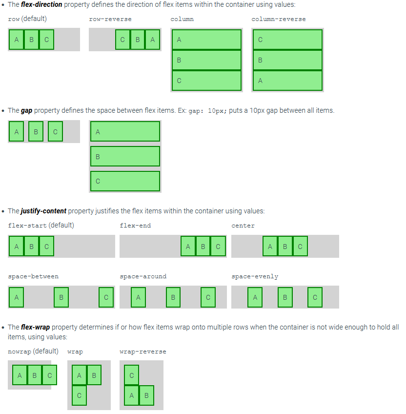
The Flexible Box or flexbox is a CSS layout mode that provides an efficient way to lay out elements in a container so the elements behave predictably when the container is resized or viewed on different screen sizes.
A flex container is an element that has the CSS property display set to flex to create a block-level flex container or inline-flex to create an inline flex container. Ex:
<div style="display: flex">Flex container properties
Several CSS properties modify the default behavior of a flex container.
Flex item properties
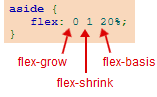
A flex item's width is determined by the combination of three CSS properties:
The flex-basis property sets the initial length of a flex item. The values can be auto (the default), a percentage, or a length unit. The default value auto makes the flex item the same initial length as the content.
The flex-grow property sets a proportion that determines how much of the available container space should be assigned to the item. The default is 0, meaning the size should be based on the item's content.
The flex-shrink property sets a proportion that determines the item's minimum size. The default is 1, meaning the size should shrink at the same rate as other items when the container width shrinks. A value of 0 means the item should not change sizes when the container width shrinks.
Flexbox shorthand
The shorthand property flex specifies flex-grow, flex-shrink, and flex-basis together. Ex: flex: 0 1 auto; is the same as flex-grow: 0; flex-shrink: 1; flex-basis: auto;.
Exploring further:
HTML Layouts from W3Schools
CSS Flexbox from W3Schools