Week 2 - Day 2 - Class Day 5
5.1: Forms
The <form> Element
The <form> element allows the web browser to submit information from the user to the server. The <form> element has two primary attributes:
The action attribute indicates the URL where the form data should be sent. Typically the URL uses HTTPS so the form data is encrypted.
The method attribute indicates the HTTP request type the browser will use to communicate with the server. The method is either GET or POST. GET is the default method if no method is specified.
GET Method
The GET method is a technique used by a web browser to submit information to a web server by altering the URL of the HTTP request. When a user clicks the submit button in a form that uses the GET method, the browser performs the following steps:
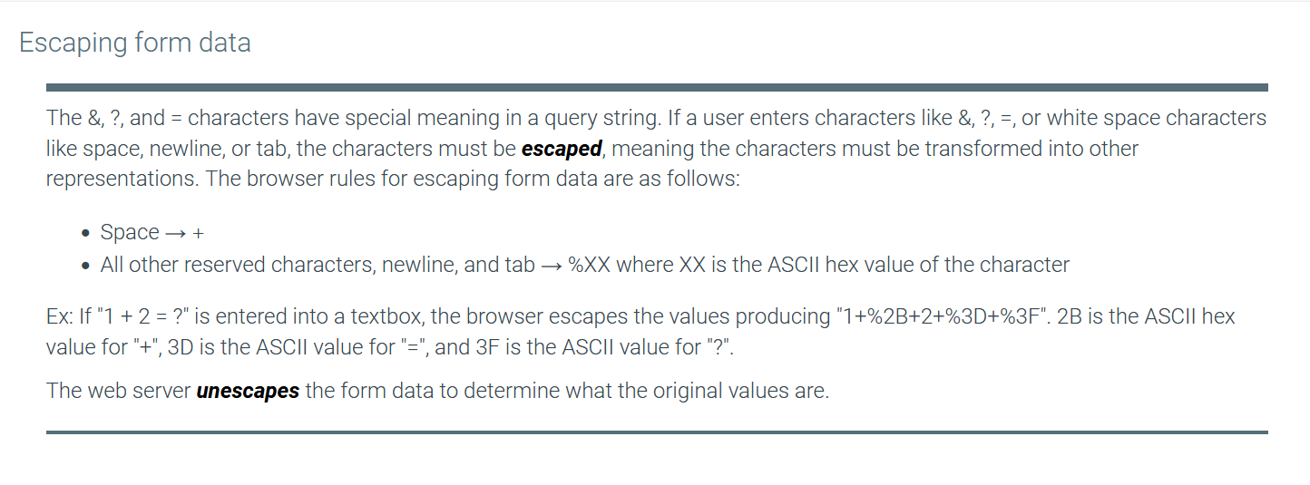
Collect all data from the form fields into a query string. The query string is a set of name=value pairs separated by the ampersand character (&). Each name is specified as an attribute of the HTML field, and the value is the user-entered data. Ex: The first and last field names and values in the animation below become the string: first=Rick&last=Deckard
Create a URL with the server page and name=value pairs. The URL is composed of the action attribute specified in the form, the question mark character (?), and the query string. Ex: http://example.com/apply?first=Rick&last=Deckard
Use the newly created URL to create and send an HTTP GET request.
Display or update the webpage using the HTTP response received from the server.
POST Method
The POST method is a technique used by a web browser to submit information to a web server by sending the information in the HTTP request body. When the user clicks the submit button in a form that uses the POST method, the browser performs the following:
Create an HTTP POST request using the URL from the form's action attribute.
Create a query string from the form data. Ex: first=Sarah&last=Connor
Place the query string in the HTTP request message body, and send the request.
Display or update the webpage using the HTTP response received from the server.
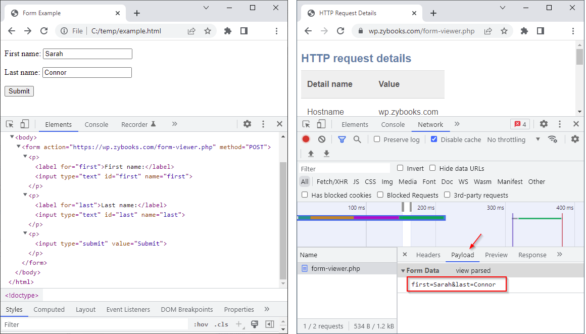
The left side of the figure below shows a webpage opened in Chrome. The DevTools show the page's form, which is POSTing to a zyBooks URL. The user entered her name Sarah Connor before pressing Submit. On the right, the user has pressed Submit, and the DevTools show the details of the HTTP request. The Payload tab shows the query string created from the form data.
If a form field contains binary data such as an image, the normal format of the query string is not sufficient to encode the binary data. To accommodate binary data, a POST request can be split into multiple parts. The <form> element's enctype attribute value "multipart/form-data" indicates the web browser should split a POST request into multiple parts, where each input field is sent as a separate part of the HTTP request message.
Form Widgets
A widget is an interactive component that the browser can use to interact with the user
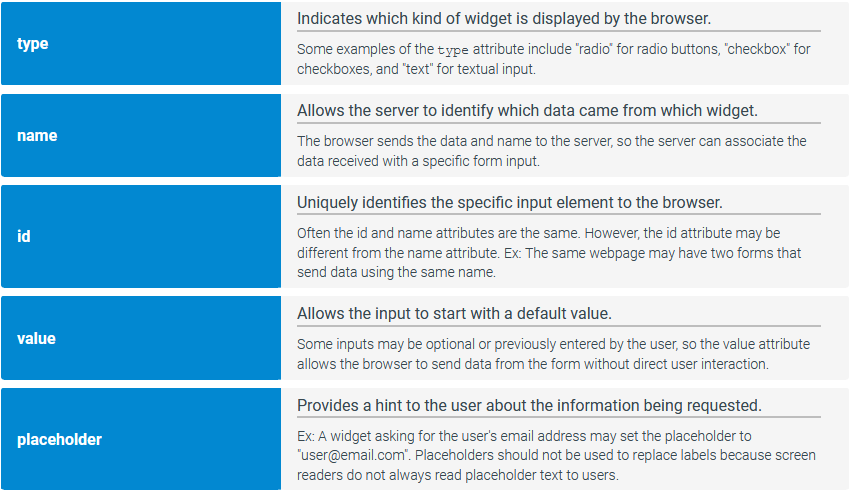
The <input> element allows the user to enter information into a webpage. The <input> element is a void element with five primary attributes:
The type attribute indicates the widget type. Common types include text, password, submit, and button.
The name attribute names the widget and sends the widget's value when the widget's form is submitted.
The id attribute is used to give a widget a unique identifier.
The placeholder attribute specifies text that first appears in a text widget, typically for giving the user a hint as to the expected value.
The value attribute specifies a default value for a widget.
A text box widget is an <input> element with the type attribute of "text" that allows users to enter a single line of text.
The web browser displays a submit button widget for an <input> tag with the type attribute of "submit", which sends the associated form's data to the server when clicked. A submit button uses the value attribute to specify the button's text.
Labels and text areas
The <label> element displays descriptive text associated with a specific widget. A label has a for attribute whose value should match the id attribute for the widget being labeled. Labels help people using screen readers understand what input is expected.
A text area widget allows users to enter multiple lines of text and is created with the <textarea> element. A <textarea> element has optional rows and cols attributes to specify the initial size of the text area.
Example Form with <textarea>, <input> and <form> examples:
<form action="https://wp.zybooks.com/form-viewer.php" target="_blank" method="POST">
    <p>
       <label for="first">First name:</label>
       <input type="text" id="first" name="first" placeholder="Text box">
    </p>

    <p>
       <label for="last">Last name:</label>
       <input type="text" id="last" name="last" placeholder="Second text box">
    </p>

    <p>
       <label for="address">Address:</label>
       <textarea id="address" name="address" placeholder="Text area with 7 rows and 50 cols" rows="7" cols="50"></textarea>
    </p>

    <p>
       <input type="submit" value="Submit">
    </p>
 </form>
Exploring further:
enctype attribute from W3Schools
Sending form data from Mozilla Developer Network
5.2: Common form widgets
Checkbox
A checkbox is a widget for input elements with the type attribute of "checkbox", which allows users to check, or select, a value. A checkbox initially appears selected if the checked attribute is set. Ex: <input type="checkbox" checked> creates a checked checkbox. The checked attribute is an example of a boolean attribute. A boolean attribute is an attribute that is true when present and false when absent. No value must be assigned to a boolean attribute.
For each checkbox selected, the browser sends the checkbox's name and value to the server. If the value attribute is not specified, the default value of "on" is sent. If a checkbox is not selected, the browser does not send anything to the server. A common error on the server is failing to record all checkboxes in the form as the browser doesn't report any values for checkboxes not selected by the user.
Good practice is to use label elements with checkboxes so the user can click the label to check and uncheck the associated checkbox.
Example
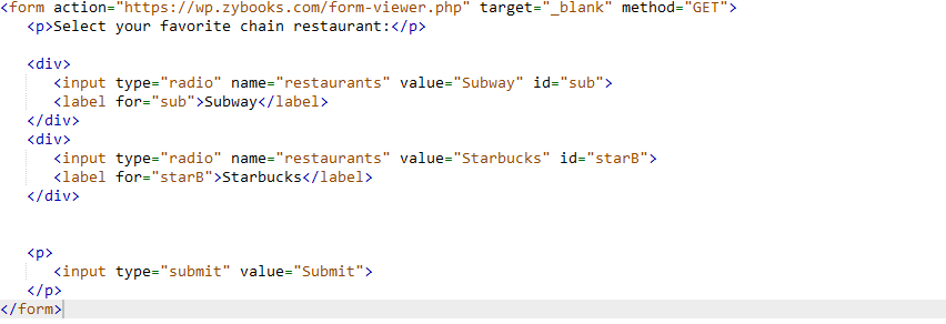
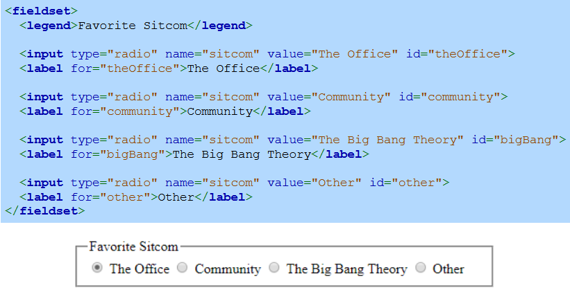
Radio button
A radio button is a widget for input elements with the type attribute of "radio", which allows users to select exactly one value from possibly many values. The web browser groups radio buttons together with the same name attribute, where each possible value in a group has an associated input. When submitting a form, the browser sends the selected radio button's name and value attribute. Ex: If the radio button is selected, "movie=ET" is sent to the server.
The main difference between a radio button and checkbox is that only one radio button in a group can be selected, while any number of checkboxes can be selected.
Radio buttons follow the same syntax as the checkbox with an input and a label, however the name stays the same for all options in a group of radio buttons, with the value changing to represent different values
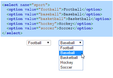
Drop-down menu
The <select> element creates a drop-down menu (or drop-down list), which allows users to select one of several predefined values. The <option> element creates a value, or option, the user can select within a drop-down menu. When the user is not interacting with the menu, the drop-down menu usually displays the selected option.
The difference between a drop-down menu and a radio button widget is that the drop-down menu only displays the options when interacting with the user, while a radio button widget always displays all options.
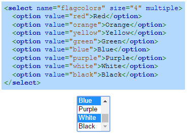
List box
A list box widget is created by specifying a size with the select element's size attribute. Ex: <select size="4"> creates a list box that shows four options at a time. If the list box contains more than size options, the browser adds a vertical scrollbar so the user can scroll through the list of options.
The multiple attribute allows the user to select multiple options. On Windows, the user must hold down the control (Ctrl) button to select multiple options, and on a Mac, the user must hold down the command button. Many users are unaware of how to choose multiple options from a list box, so good practice is to use checkboxes instead.
Buttons
A button widget can be created using the <button> element or with <input type="button">. The <button> element allows text and images to be displayed in a button, but an <input> button only allows text.
The <button> element has a type attribute that can be set to various values like "button" or "submit". The "button" type is typically used with JavaScript to perform an action when clicked. The "submit" type creates a submit button for a form. If the type attribute is not specified, different browsers may choose different default types, so good practice is to always specify the type.

Password field
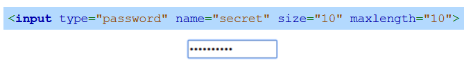
A password field is a widget for input elements with the type attribute of "password", which allows users to enter a password without the password contents being displayed on-screen. Web browsers usually provide facilities to remember passwords at various websites to help users.
Forms that submit passwords or any sensitive data should always submit with URLs that use HTTPS. Form data submitted with HTTP are not encrypted, but HTTPS encrypts form data.
The HTML below uses the size attribute to limit the password field's width and uses the maxlength attribute to limit the maximum number of characters the user can enter. The size and maxlength attributes can be used on text boxes as well.
Fieldset
The <fieldset> element groups related form widgets together and draws a box around the related widgets. The <legend> element defines a caption for a <fieldset>.
Exploring further:
HTML <input> tag from W3Schools
HTML <select> tag from W3Schools
HTML <button> tag from W3Schools
5.3: Additional Form Widgets
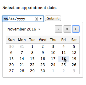
Date picker
An input picker is a widget that allows the user to interactively pick a choice using a popup or other guided selection method. The date picker is an input picker that allows the user to enter a date or choose a date from a calendar popup.
The basic syntax for the date picker is <input type="date">. Two common attributes for the date input are min (the earliest date permitted) and max (the latest date permitted).
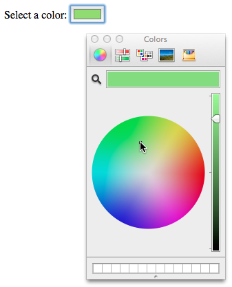
Color picker
Clicking on the color picker creates a color selector popup that helps the user explore and choose a color.
The basic syntax for the color picker is <input type="color">.
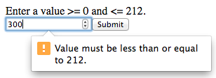
Number input
The number input ensures user input is a valid number.
The basic syntax for the number input is <input type="number">. The min and max attributes are commonly used with the number input.
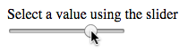
Range input
The range input widget allows the user to select a value by dragging a sliding control along the length of a line.
The basic syntax for the range input is <input type="range">. Three commonly used attributes for the range input are min, max, and value.
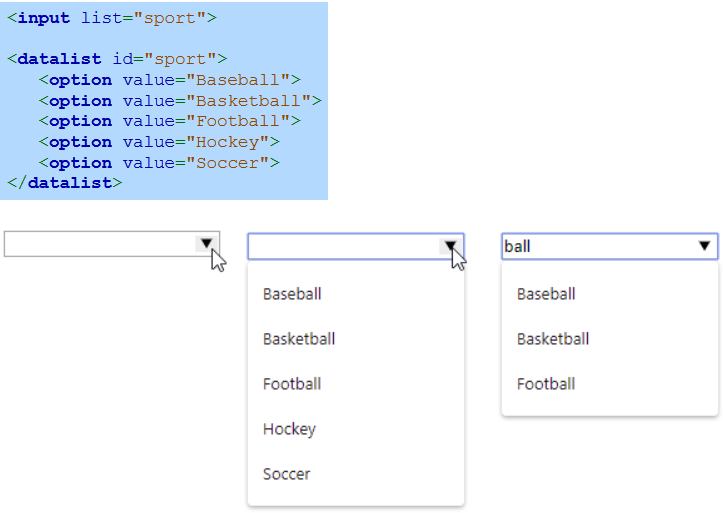
Combo box
A combo box is the combination of a text box and drop-down menu into a single widget. A combo box is created with an <input> element, which creates the text box, and a <datalist> element, which provides the drop-down list options.
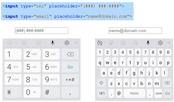
Specialised text input
Four input types exist for entering specific types of text:
url - For typing a URL
tel - For typing a telephone number
email - For typing an email address
search - For typing search terms
Most mobile browsers display keyboards configured for entering the input type.
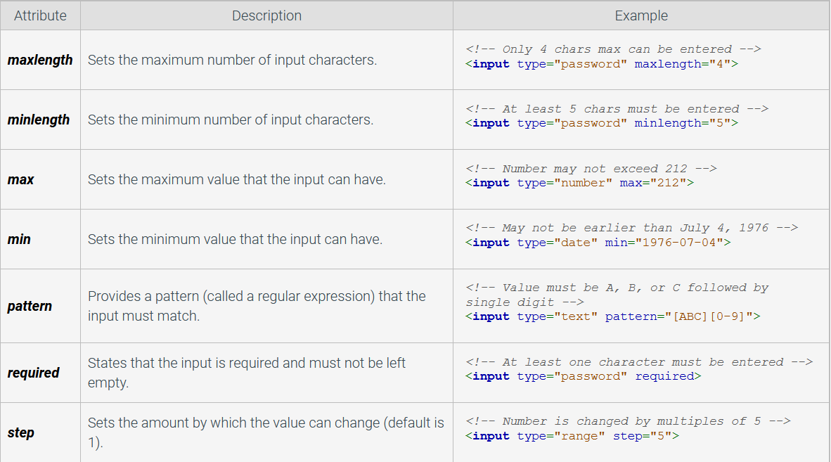
Form validation
Form validation is preventing incorrect form input from being submitted. A form's input elements can use the attributes in the table below to restrict user input.
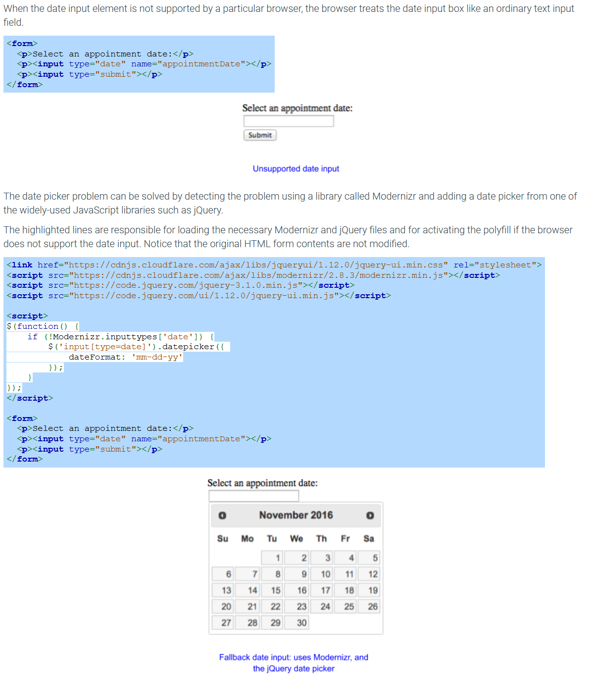
Fallbacks and polyfills
Not all widgets and attributes are fully supported by all browsers. Ex: Older browsers may not show a color input picker, so users must instead enter a hex string representing the red, green, and blue values of the color, like #4268D3, into a text input field.
A fallback is a mechanism that allows a webpage element to function correctly even if the browser does not support a particular element. Good practice is to implement a fallback mechanism if a particular widget is not widely supported by browsers at the time.
A polyfill is a fallback using JavaScript code that makes certain HTML features (Ex: the date picker) work on browsers that do not natively support those features. Developers often use a JavaScript library such as Modernizr to detect which features the browser does not support, and then load one or more polyfills to provide fallback mechanisms for the non-supported features.
Exploring further:
5.4: Audio and video
Audio element
The <audio> element plays an audio file in a webpage. The <source> element is used inside the <audio> element to specify an audio file to play. Some common <audio> attributes include:
autoplay - Boolean attribute that makes the audio begin playing automatically.
controls - Boolean attribute that displays audio controls for the user to play, pause, and control the volume.
loop - Boolean attribute that replays the audio upon reaching the end of the audio.
muted - Boolean attribute that initially mutes the audio.
NOTE: Some browsers block <audio autoplay> from autoplaying so users are not jolted with sound when visiting a webpage.
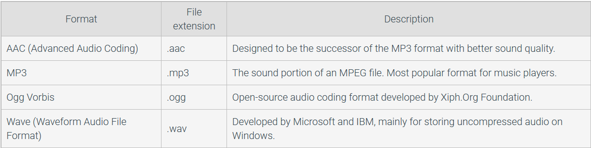
Different web browsers support different audio formats, so multiple <source> elements can be used to supply alternate file formats. The MP3 and AAC formats have wide browser support.
Video element
The <video> element displays a video in a webpage. The <source> element is used in a <video> element to specify the name of the video file to play. Some common <video> attributes include:
autoplay - Boolean attribute that makes the video begin playing automatically.
controls - Boolean attribute that displays video controls for the user to play, pause, and control the volume.
loop - Boolean attribute that replays upon reaching the end of the video.
muted - Boolean attribute that initially mutes the video.
width - Specifies the pixel width of the video's display area.
Some browsers will not autoplay a video unless the video is muted. Ex: <video autoplay muted> will play a muted video successfully in all browsers. Muted video is less jarring to users when visiting a webpage.
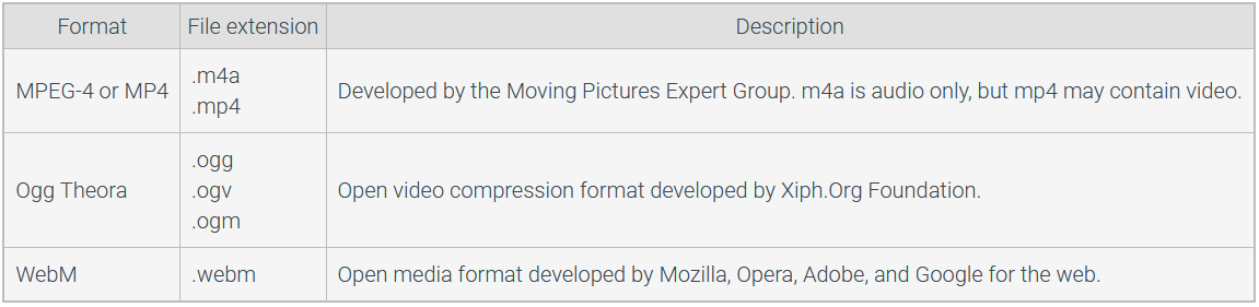
Different web browsers support different video formats, mainly because of patent issues. Multiple <source> elements can be used to supply alternate file formats. MP4, WebM, and Ogg are ideal video formats for playing video on the web.
Common Video Formats
Controlling media playback with JavaScript
The audio and video elements can be controlled with JavaScript. Ex: JavaScript can start and stop audio, change the volume, and jump to a specific location in a video. See the HTMLMediaElement link in Exploring further below for a list of JavaScript properties and methods to control audio and video.
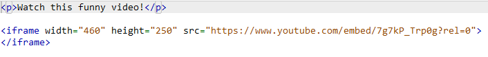
Showing YouTube videos
A YouTube video may be embedded in a webpage with the <iframe> element. The <iframe> element allows a webpage to be embedded in a rectangular area of the current webpage. The <iframe> element uses the src attribute to specify the URL of the webpage to display and the width and height attributes to define the width and height in pixels of the rectangular iframe.
The YouTube Help pages give instructions for uploading a video to YouTube and embedding a video into a webpage.
Exploring further:
HTML Video from W3Schools
HTML Audio from W3Schools
HTML Plug-ins from W3Schools
Media formats supported by the HTML audio and video elements from MDN
HTMLMediaElement from MDN
5.5: <script> and <style>
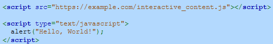
The <script> element allows a webpage to include executable code, which the browser assumes to be JavaScript unless indicated otherwise. The optional type attribute specifies the content type when the content is not JavaScript. The src attribute provides the URL of an external file containing JavaScript code. If a <script> element does not have the src attribute, then the JavaScript code is contained directly within the element. The HTML below shows two ways the <script> element can be used.
Two ways to use the script element
A common error is to forget the closing </script> tag when using the src attribute. Even when the JavaScript code is located in a separate external file, the closing </script> tag must be included.
Good practice is to use the src attribute to separate content and functionality and promote modularity. An external JavaScript file can be edited separately from an HTML file, which allows a webpage's interactive content to be updated even if the content is unchanged. A separate JavaScript file can also be reused on many webpages to provide the same functionality for different pieces of content.
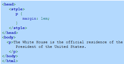
Style element
The <style> element allows the webpage to introduce presentational directives, usually CSS. A <style> element is placed in an HTML document's <head> element because the style's CSS is designed to describe the presentation of the entire document.
NOTE: Unlike all other HTML elements, the contents within the <script> and <style> elements are not displayed by the browser. The <script> and <style> elements' purpose is to provide interactive functionality and presentational styling.
5.7: HTML developer guidelines
The following developer guidelines are helpful best practices for web development. Although the guidelines and suggestions are not mandatory, good practice is to consistently follow the guidelines, which results in maintainable webpages and helps avoid errors. Cleanly-organized HTML is also easier to read and understand by other developers.
Using closing tags
For elements that have a closing tag, always use the closing tag to mark the end of the element. Ex: Standard HTML does not require closing </p> tags because the web browser can infer the ending of a paragraph, but always including the </p> closing tag to end the paragraph explicitly is safer. A common error is to expect all web browsers to add a missing closing tag at the same location in the HTML.
Don't double close tags (self-closing tags)
Some tags such as <br> and <img> do not require a closing tag (</tag>) You can put a forward slash (/) at the end of these tags and it will not cause any problems, however it is not considered good practice. Eg: <br /> or <img />
Use quotes for attribute values
Always use quotes around attribute values. Ex: Use value="Start" instead of value=Start. While HTML does not require quotes around an attribute value that does not contain a space, a common error is forgetting the quotes for attribute values that contain spaces. Ex: value=Start animation is illegal and results in an error. Another example is with assigning fonts: 'font-family: Arial' is valid however 'font-family: Times new roman' is not. PUT YOUR STUFF IN QUOTES OR YOU WILL SPEND HOURS DEBUGGING
Use double quotes
Although either double or single quotes are acceptable around HTML attribute values, good practice is to use double quotes, which in general results in more readable HTML. Ex: Use value="Start" instead of value='Start'. Inconsistent use of quotes can also lead to problems when using some web development frameworks, which assume the developer uses double quotes.
If a double quote (") needs to be placed within an attribute value, the internal double quote must be escaped. A special character such as the double quote can be escaped within an attribute value by placing the backslash character (\) before the special character, causing that character to lose any special meaning. Ex: alt="Dwight D. \"Ike\" Eisenhower".
Don't double boolean
A boolean attribute is an attribute that can only have two states, true or false (on/off, yes/no). In HTML it being present in a tag indicates that it is true for the tag and it not being present indicates false. Eg: <option selected> this selected represents 'selected = "selected"'(true) but the browser interperets this in a way to make your code more concise and readable
Older versions of HTML required all attributes to have values, so developers would use checked="checked" to indicate the checked attribute was true. Browsers continue to support the older syntax, but good practice is to only use the attribute name for a boolean attribute without specifying a value. Ex: <input type="checkbox" name="foodPreference" value="vegetarian" checked> is the preferred way to use the checked boolean attribute.
Use lowercase for all tags and attributes
Good practice is to use lowercase for all tags and attributes. Ex: Use <p> and value="Start" instead of <P> and VALUE="Start".
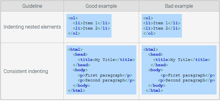
Start block elements on new lines
Each block element should start on a new line. Ex: A <p>, <table>, or <ol> element should always begin on a new line. To highlight the nature of block elements, inline elements should only start on a new line for readability purposes. Ex: A <a>, <span>, or <q> element may start anywhere on a line.
Consistent indentation
When indenting your code for readability, it should be indented at least 2 spaces, your indentation distance should stay the same throughout your code.
Seperate content from presentation and functionality
Good practice is to not use embedded or inline CSS and JavaScript. Ex: Instead of using
<p style="color:red;">No!</p><p class="attention">No!</p>Good practice is to use separate files for CSS and JavaScript instead of placing CSS and JavaScript in the HTML document. Ex: Instead of using the <style> element for specifying CSS rules within the HTML document, specify the CSS rules in a separate CSS file, such as theme.css, and import the file using <link rel="stylesheet" href="theme.css">.
Use CSS for layout
CSS is designed for layout; the <table> element is designed for holding tabular data. Good practice is to avoid using tables to manage page layout and to avoid using CSS to manage tabular data. Using tables to manage layout obscures the content and meaning of the webpage and can cause problems when trying to control layout correctly using CSS. Using CSS to build tables requires more complex JavaScript to manage data tables in more sophisticated web applications.
Validate HTML
Good practice is to validate HTML using an HTML validator and revise the HTML to eliminate any errors or warnings. One of the big challenges in web development is to make sure that the webpages are processed correctly by as many browsers as possible. Strict adherence to the HTML Living Standard generally reduces browser errors. The W3C official validator at https://validator.w3.org is free, works well, and allows validation by providing the URL, by uploading an HTML file, or by directly entering HTML.
Exploring further:
Google's style guide for HTML and CSS
W3Schools' style guide for HTML, CSS, and JavaScript